Home › Forums › Jevelin Theme › Mobile menu not visible
- This topic has 5 replies, 2 voices, and was last updated 5 years, 5 months ago by
Shufflehound Support.
- AuthorRESOLVED Posts
- Shufflehound SupportModerator
Hi @jdesign,
I hope you are well today and thank you for your question.
I visited your website but didn’t see the menu on it as shown in the attached screenshot.
Please advise.
Also, If you think that it is a theme issue then does it work fine using a default WordPress theme such as Twenty Twenty theme on your website?
Best regards,
Shufflehound teamAttachments:
You must be logged in to view attached files.jdesignParticipantHello. Please login with credentials. Website is blocked for public due to under construction. Once logged in, you will notice theme does not show mobile menu. And I don’t know if it is a theme related issue. The people from Ubermenu couldn’t solve the problem and redirected me to you (theme author) Thank you for your understanding and have a wonderful day.
Shufflehound SupportModeratorThe mobile menu works fine If we deactivate the Ubermenu plugin on your website as shown in the attached screenshot.
Could you please ask the Ubermenu plugin support that why they think it’s a theme issue and what is causing it not to work with the theme?
Attachments:
You must be logged in to view attached files.jdesignParticipantSolution for this topic
Hello. Problem has been solved.
They send me this:
<hr />
Hi Jarne,
Your theme uses two headers – one for desktop and one for mobile
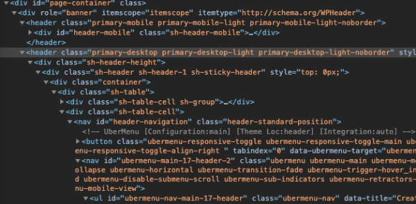
The theme is hiding the desktop header, which contains UberMenu, on mobile. The toggle you see on mobile is your theme’s toggle. The theme hides UberMenu completely, so UberMenu isn’t displayed at all.
The simplest option is to just show your desktop header on mobile instead. I’m not sure why the theme uses two separate ones, at least with this configuration it appears unnecessary. I’ve added this CSS in your Mobile CSS Tweaks:
#page-container header.primary-mobile{
	display:none !important;
}
#page-container header.primary-desktop{
	display:block !important;
}
#page-container header.primary-desktop .header-logo img{
	height:auto;
	max-height:110px;
Shufflehound SupportModeratorAwesome great to see you got that solved.
Please advise if you have more questions.
Have a fantastic day!
- AuthorPosts