Forum Replies Created
- AuthorNOT RESOLVED Posts
- jdesignParticipant
Damn, I wish I was that smart…
Thanks a lot for all the help to (all of) you. Have a great weekend.
in reply to: Translate question + arrows in portfolio single postjdesignParticipantHello!
It works perfect, thank you for that.
However on my portfolio page itself the white text is not readable now.
- On the main page: https://www.jdes.be/ it is perfect, the white text on the dark background.
- I think it changed the color on this page too: https://www.jdes.be/portfolio/
- Can I individually change the color on that page?
Thank you
Jarne
in reply to: Translate question + arrows in portfolio single postjdesignParticipantWhen using the Gallery Dynamic Slider, is it possible to add arrows left and right? People don’t notice that they can click and scroll now. The “standard” Gallery slider is perfect actually, but that crops the pictures too much.
Could you please share the page URL from your site where it is displaying so that I can help you?
=> A few examples: https://www.jdes.be/project/ellyne/ – https://www.jdes.be/project/avat/ – https://www.jdes.be/project/alison/ –
Second screenshot. How can I change the dark text in to white? It’s not readable for now. If possible only the portfolio title text “sh-portfolio-title”
Could you please share the page URL from your site where it is displaying so that I can help you to change its color?
https://www.jdes.be/ – main page.
About the translation. I edited the “Related items” to “Bekijk ook” in Loco Translate, however it doesn’t affect the front end. ?
in reply to: Translate question + arrows in portfolio single postin reply to: Translate question + arrows in portfolio single postjdesignParticipantHello,
At the portfolio page, it’s ok for me now, thank you!
Is there a way however – on the home page – to pop up the YOutube video behind it when clicking on the arrows?
If you click now, you just have the image. See recording: https://screencast-o-matic.com/watch/crhnDGVeGsT
Potential clients want to review video’s quickly, not to open a seperate page each time.
Could you suggest a solution for this?
Thank you so much by the way for the prompt reply (in the weekend). Excellent service.
in reply to: Portfolio / projectsjdesignParticipantSolution for this topic
Hello. Problem has been solved.
They send me this:
<hr />
Hi Jarne,
Your theme uses two headers – one for desktop and one for mobile
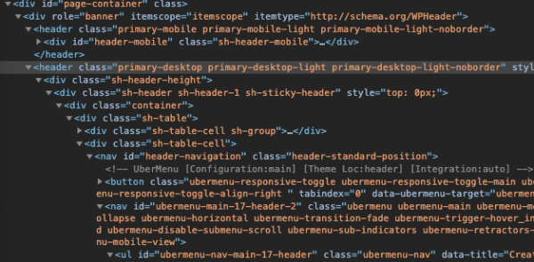
The theme is hiding the desktop header, which contains UberMenu, on mobile. The toggle you see on mobile is your theme’s toggle. The theme hides UberMenu completely, so UberMenu isn’t displayed at all.
The simplest option is to just show your desktop header on mobile instead. I’m not sure why the theme uses two separate ones, at least with this configuration it appears unnecessary. I’ve added this CSS in your Mobile CSS Tweaks:
#page-container header.primary-mobile{
	display:none !important;
}
#page-container header.primary-desktop{
	display:block !important;
}
#page-container header.primary-desktop .header-logo img{
	height:auto;
	max-height:110px;
in reply to: Mobile menu not visiblejdesignParticipantHello. Please login with credentials. Website is blocked for public due to under construction. Once logged in, you will notice theme does not show mobile menu. And I don’t know if it is a theme related issue. The people from Ubermenu couldn’t solve the problem and redirected me to you (theme author) Thank you for your understanding and have a wonderful day.
in reply to: Mobile menu not visible - AuthorPosts